
Why I want to make this practice
In my previous project experiences, despite leveraging powerful design tools like Figma, which conveniently convey the designer’s vision to developers, there was a persistent challenge.
Usually, when a design was translated into code, discrepancies emerged, leading to a repeated cycle of reviews and modifications. This process could be lengthy, as designers had to wait for developers to integrate and style components before they could validate the outcomes. Sometimes, designers also wished to explore multiple styling options, including different colors and responses to various screen sizes.
My Thinking
This led me to contemplate a methodology that enables immediate validation of component designs by designers, right after their development.
I believe a synergistic approach, integrating Storybook with a Remix project, serves as an effective solution. Envision a structure where the root directory is a Remix project, embedding a Storybook project.
Each atomic component or complex component can be developed and showcased in Storybook.
When frontend engineers receive tasks from designers, they can focus on creating standalone components without dependency on the project’s state. Upon completion the component in storybook, these components can be immediately deployed to a test environment via Storybook, allowing designers to perform validations.
Furthermore, the engineers can follow the styles defined in Storybook for further development in the Remix project.
What are the benifits?
- Direct Implementation of Styles: The Remix project can directly import styles from the Storybook, ensuring consistency and reducing redundancy.
- Rapid Prototyping and Review: This setup facilitates rapid prototyping of components and immediate review by designers, streamlining the development process.
- Flexible and Reusable Components: Components developed in Storybook, using mock data and associated SCSS files, are flexible and reusable within the Remix app.
- Enhanced Collaboration: This approach bridges the gap between designers and developers, fostering a more collaborative and efficient workflow.
In essence, the Remix project and Storybook work in tandem, where the remix-project/styles/main.scss file integrates styles from storybook/.stories/atoms/button/button.scss. The Storybook’s directory, such as storybook/.stories/atoms/button, includes button.tsx and button.stories.tsx, leveraging simple mock data and SCSS styles. These components, once designed in Storybook, seamlessly integrate into the Remix project, enhancing both the development experience and the final product.
Let’s start building and integration
Initialize storybook
Initialize your remix application using the remix scaffolding tools
npx create-remix@latestEnter into the application directory and create a storybook directory
cd remix-storybook-app #remix-storybook-app is my project name
mkdir storybook
cd storybook
touch package.json
Then open package.json use either command line or text editor ui. Paste the following content into package.json or any content into package json, including {name, version} should be enough.
{
  "name": "storybook",
  "version": "1.0.0"
}
The reason why it needs to create a package json is because storybook cannot be installed in empty folder, so a minimum package.json can help to solve this.
Your application directory now should look like

Optionally, you can also use the following package.json , which could initialize the storybook into react/typescript.
{
  "name": "storybook",
  "private": true,
  "scripts": {
    "storybook": "start-storybook -p 6006",
    "build-storybook": "build-storybook"
  },
  "devDependencies": {
    "@storybook/react": "^7.6.10",
    "@storybook/addon-essentials": "^7.6.10",
    "@storybook/addon-links": "^7.6.10",
    "@storybook/addon-actions": "^7.6.10",
    "typescript": "^5.1.6",
    "@types/react": "^18.2.20",
    "@types/react-dom": "^18.2.7",
    "react": "^18.2.0",
    "react-dom": "^18.2.0"
  }
}
Now you can install storybook using the caffolding tools
npx sb initAfter the intialization is done, you can run the following command to verify is your storybook is installed properly
npm run storybookYou should be able to see an interactive storybook contains the 3 basic examples: [button, header, page]
The directory of the whole remix app should look like the following image.

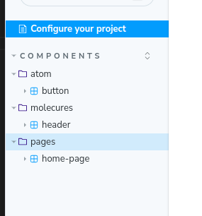
From my thinking, we need to split the stories into different categories.
The smallest atomic component we can put it into atoms and complex components we can put it into molecures . The general layout of a page we can put it into pages. Now lets restructure the structure of storybook a little bit.

Optional, we also want to integrate scss into the stroybook. To achieve this, we can use the following command under storybook directory.
npm install @storybook/addon-styling-webpack sassTo verify if your sass is installed successfully, rename button.css into button.scss or button.sass , update the import in button.tsx as well, and restart storybook.
Storybook is using the title in story to control the display of the category of components, for example, if title is components/atoms/button , components/molecures/header , components/pages/home , the storybook will look like this, a more clear structure
Now we have almost set up the storybook and sass integration, but now we will need to integrate the storybook into the remix application.
As I have mentioned before, storybook is to create standalone components without dependency on the project’s state , so the components in storybook should be kept simple and no state, the engineer should always start to make story first on small components and hand in to the designers to check the result before they develop the components inside the remix application.
This means the components inside storybook is just for display purpose, but cannot be directly used inside the application. But something we can reuse is the sass/scss inside storybook. A good benefit is, as the sass/scss are located within the same directory inside storybook with the component, once some changes are required, it will be much more easy to apply the change.
Integrate the sass/scss into remix application.
By default, Remix doesn’t process SCSS or SASS files. Unlike some other frameworks that have built-in preprocessors for handling these types of files, Remix requires you to set up an external process to compile SCSS/SASS files into CSS. This is typically done using a Node.js script or a tool like Gulp or Webpack. The script/tool watches for changes in your SCSS/SASS files, compiles them, and generates CSS files that you can then link to in your React components.
So in order to achieve this, we need to add something extra.
The right way for remix application is, when running the start or build or dev command, it should build the scss into css first. Thus, we need to change a little bit of the run script in package.json .
First, we add a script to compile SCSS files. This script runs the sass command to process all SCSS files in the styles directory and output them to the public/styles directory.
"build:css": "sass styles/:public/styles/"The build script should compile SCSS files into CSS and then proceed with building the Remix app. The && operator ensures that the Remix build starts only after the SCSS compilation is successful.
"build": "npm run build:css && remix build"In development, we want to compile SCSS files in real-time as they change. The sass --watch command monitors the styles directory and compiles SCSS files whenever they are updated.
"sass:dev": "sass --watch styles/:public/styles/"To run this script alongside the Remix development server, we use concurrently to handle multiple processes. This tool allows us to start the SCSS compilation and the Remix server simultaneously.
"dev": "concurrently \"npm run sass:dev\" \"remix dev\""We might also need to install concurrently
npm install concurrentlyNow, apply the path in tsconfig.json , add
"paths": {
      "~/*": ["./app/*"],
      "~/styles/*":["./public/styles/*"]
    },
The reason for above change is because, build:scss and scss:dev scripts will compile the scss/sass into css under public/styles directory, and it is a common agreement that, the tsx file should avoid using absolute path. So inside the tsx file, it should always use ~/styles/ rather than ../../public/styles or /public/styles .
Now your run scripts in package.json should look like the below:
  "scripts": {
    "build": "npm run build:css && remix build",
    "dev": "concurrently \"npm run sass:dev\" \"remix dev\"",
    "lint": "eslint --ignore-path .gitignore --cache --cache-location ./node_modules/.cache/eslint .",
    "start": "remix-serve ./build/index.js",
    "typecheck": "tsc",
    "build:css": "sass styles/:public/styles/",
    "sass:dev": "sass --watch styles/:public/styles/"
  },
Now create a styles directory under the root path of the remix application, add a main.scss into this directory.
touch /styles/main.scssImport any scss from storybook like following

And add an element into the home page to see if the styles from storybook is succesfully imported from the storybook. As I have import the styles of button, I will add a button element.
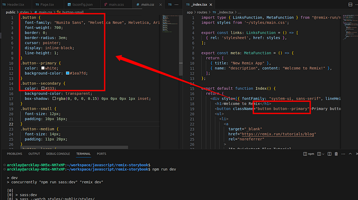
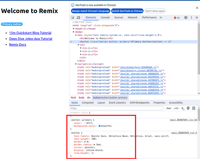
Now run npm run dev , inspect the element, this can show the scss is successfully integrated into remix app from storybook
The above progress is just a simple example of how to integrate the scss/sass and storybook into remix project , furthermore, as the storybook is embedded as a standalone project, the storybook can have a dockerfile and deployed separated just for design team validation, both benefit the engineer and the design team.